The mission to redesign a 50-year-old medical publication.
The Associação Paulista de Medicina (São Paulo Medical Association) is a non-profit organization that represents the interests of physicians in the state of São Paulo. Since 1930, APM has been contributing to the development of public health policies and the improvement of medical services, advocating for professional valorization in both public and private spheres.
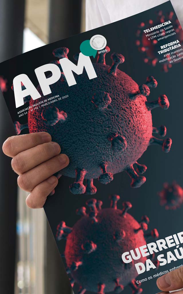
The Revista da APM (APM Magazine), its house organ, is sent every month to more than 30,000 associated doctors. It brings articles and news about the struggles of the medical profession, covering various topics of interest to physicians and society.
Our work with this client involved three fronts:
01. Redesign
The graphic design renewal and editorial restructuring were developed with the goal of not only making the publication more attractive but also promoting more efficient communication, instilling credibility, and attracting advertisers and clients to APM.
NEW STRUCTURE
Keeping with the vibe of the content, we shuffled things around into three main blocks, each marked by a different color from the brand’s palette in the top and bottom parts of the pages.

COLOR PALETTE
We worked with the color palette that APM already uses, respecting its visual identity. We only adjusted the black color to make it more visually comfortable for reading.

VOICES OF THE PUBLICATION
We picked out font styles made just for articles and stories. Easy on the eyes, almost like they’re not even there, but packing a whole lot of character.

A FRESH GRID
In the spirit of making things more lively and less tiresome to read, we cut down on wordiness and gave more love to images. We also tossed in the choice to sprinkle attention-grabbing bits throughout the pages, keeping readers hooked and offering a layered experience.

02. Layout
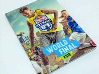
Every month, we cook up the visuals for Revista da APM based on what the Association’s crew sends our way. We roll up our sleeves to craft article layouts, tweak images and illustrations, and manage the flow through all the checks and final touches.


03. Promo stuff
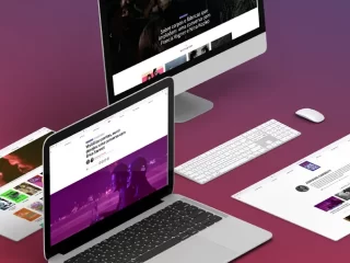
As part of the whole deal for each edition, alongside the layout hustle, we whip up some online promo goodies: social media posts and email magic, all about showcasing the good stuff and giving a friendly nudge to dive into the publication.