THE MISSION
Nice to read
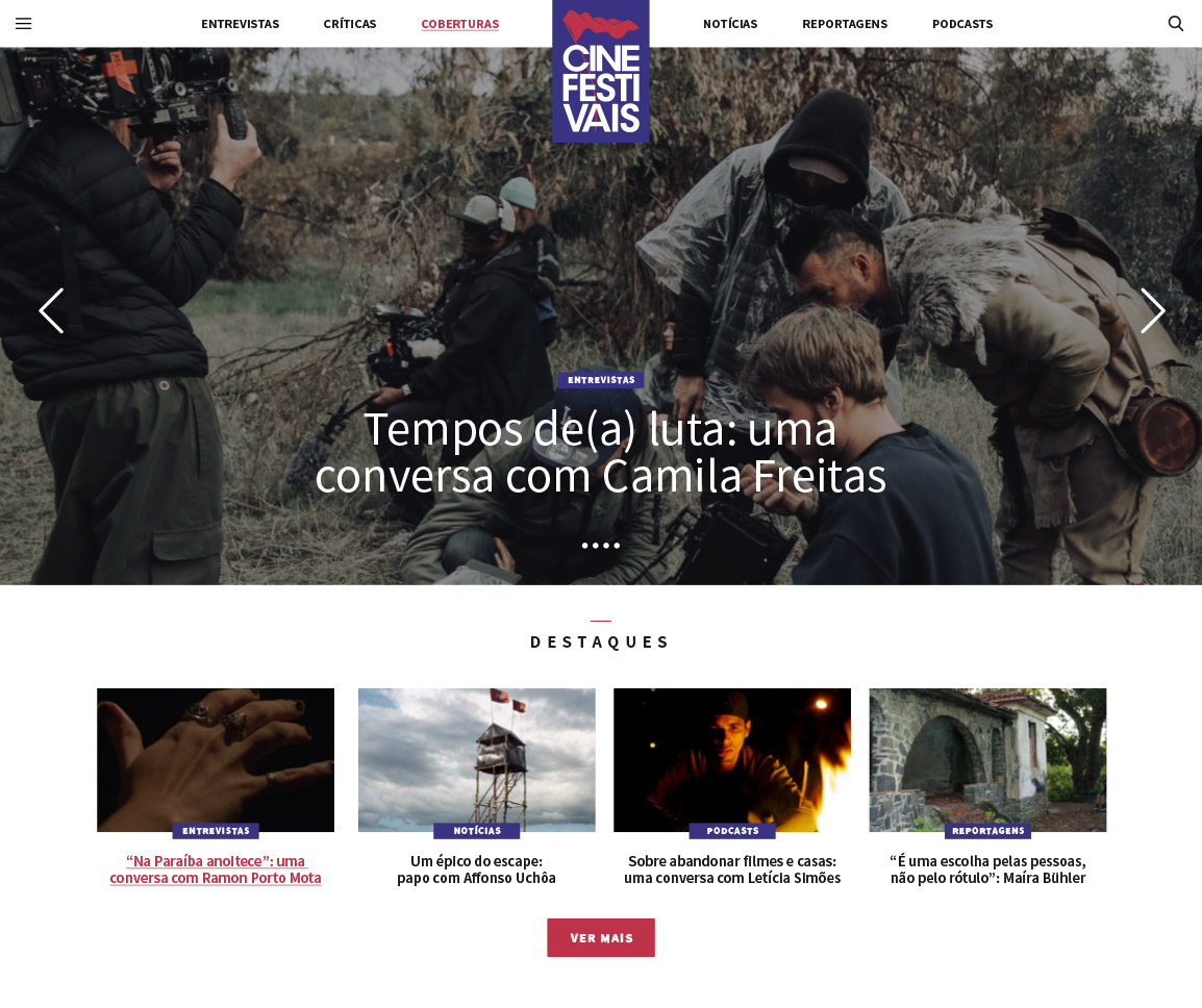
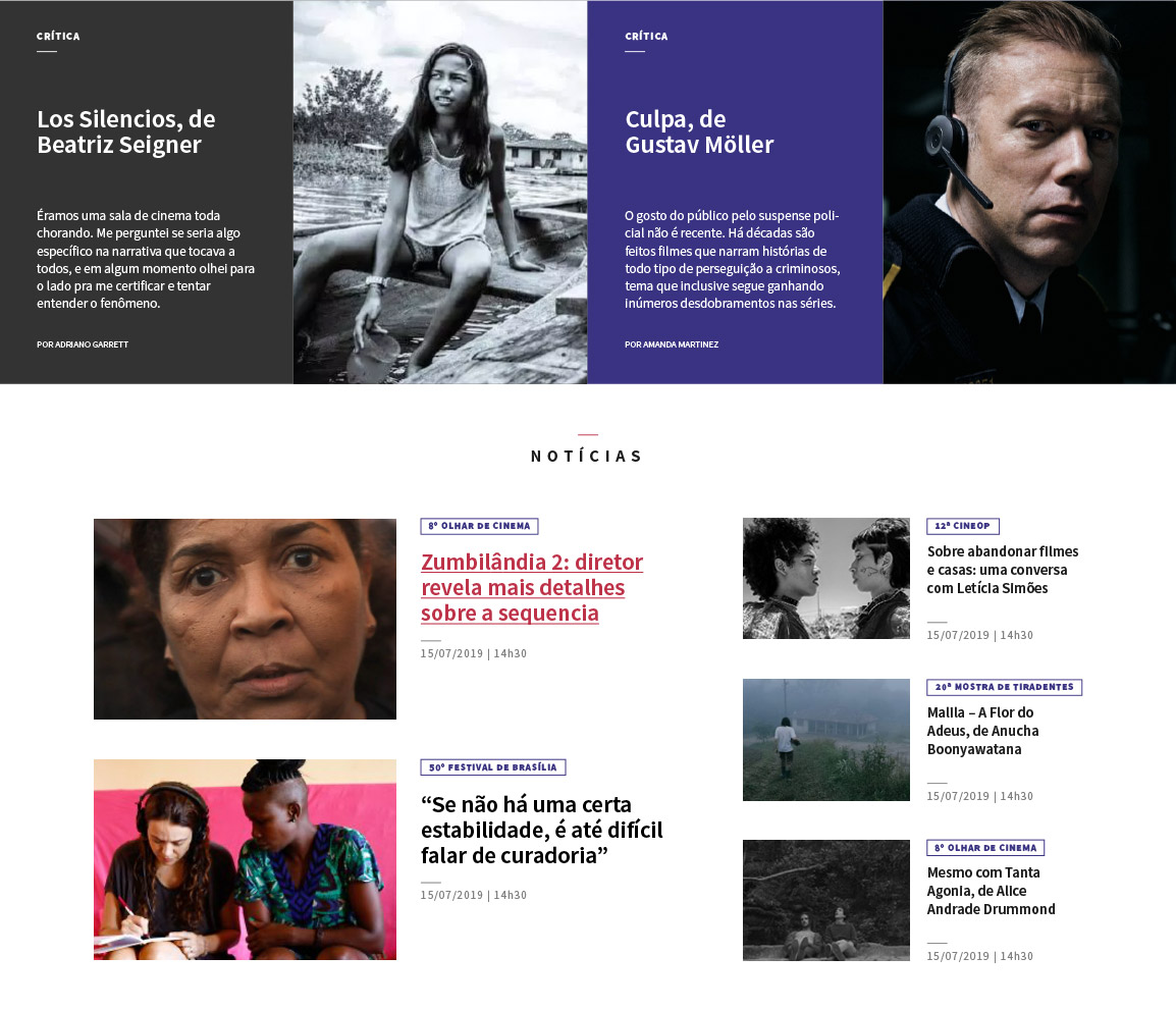
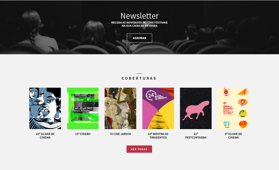
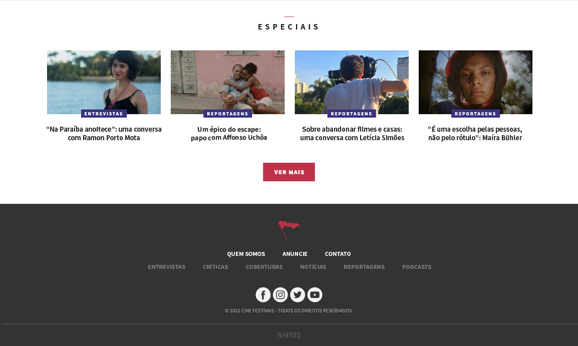
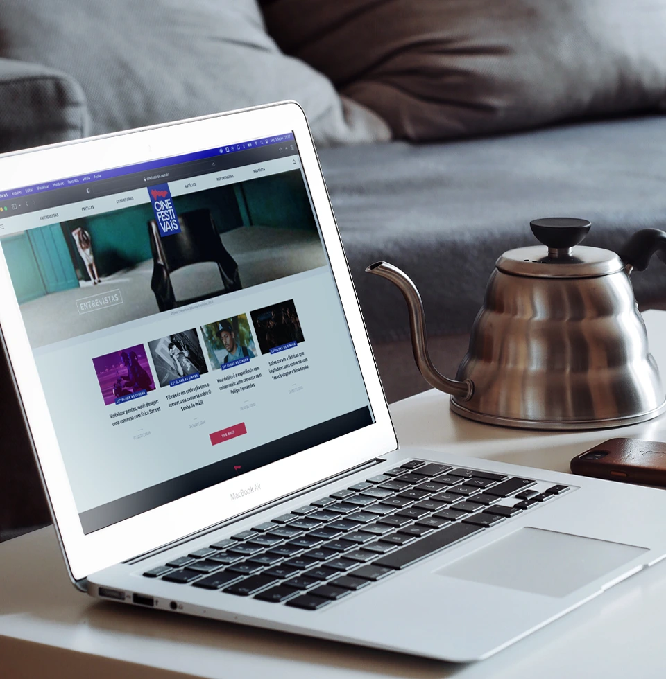
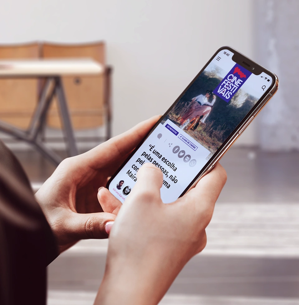
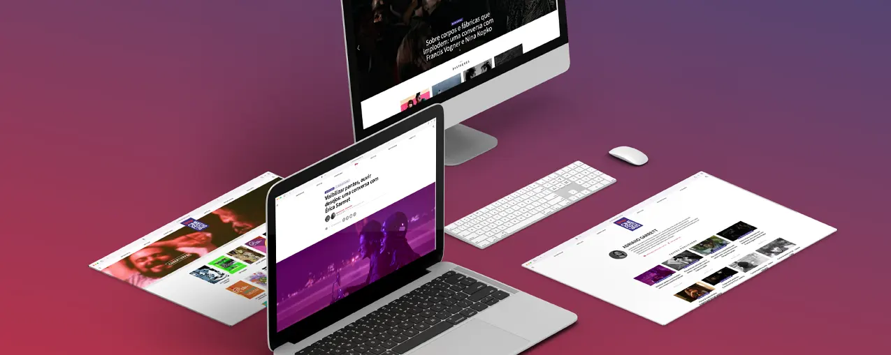
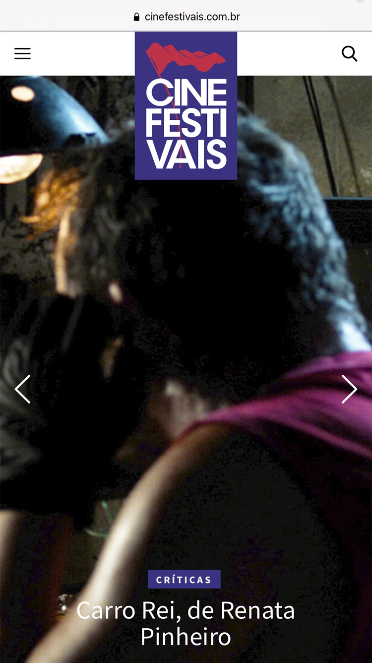
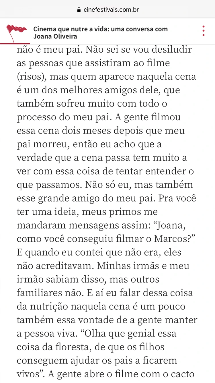
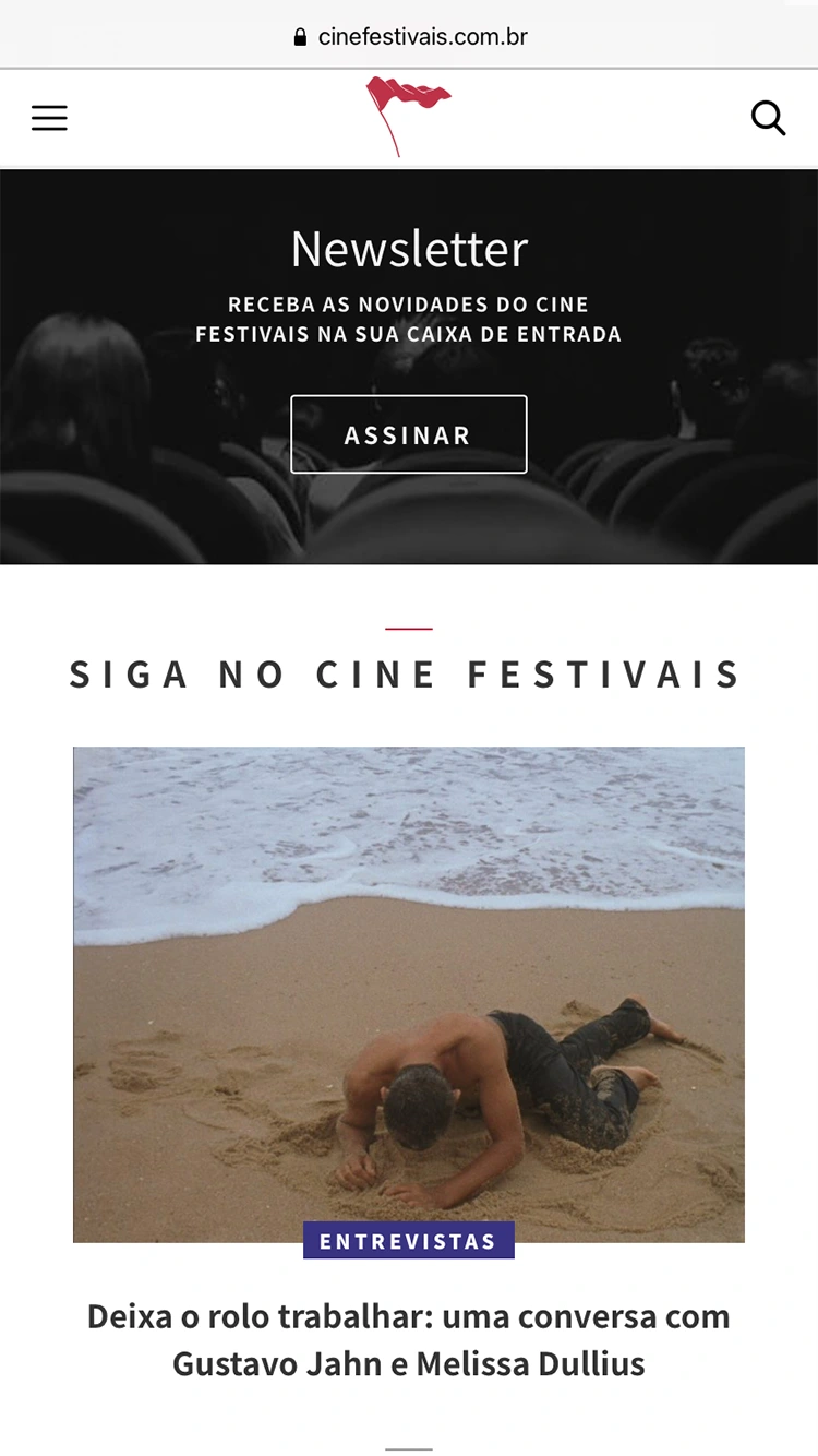
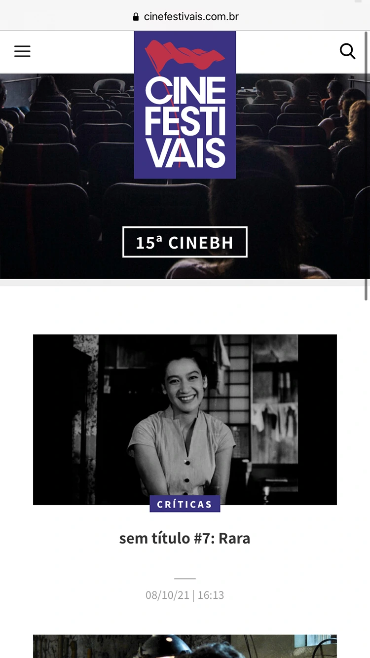
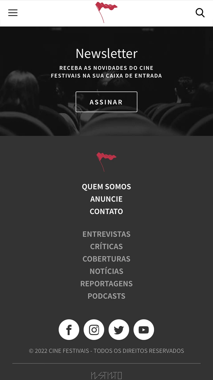
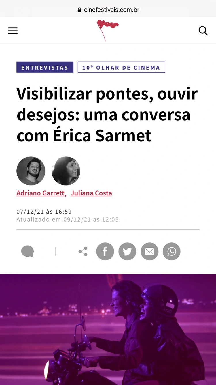
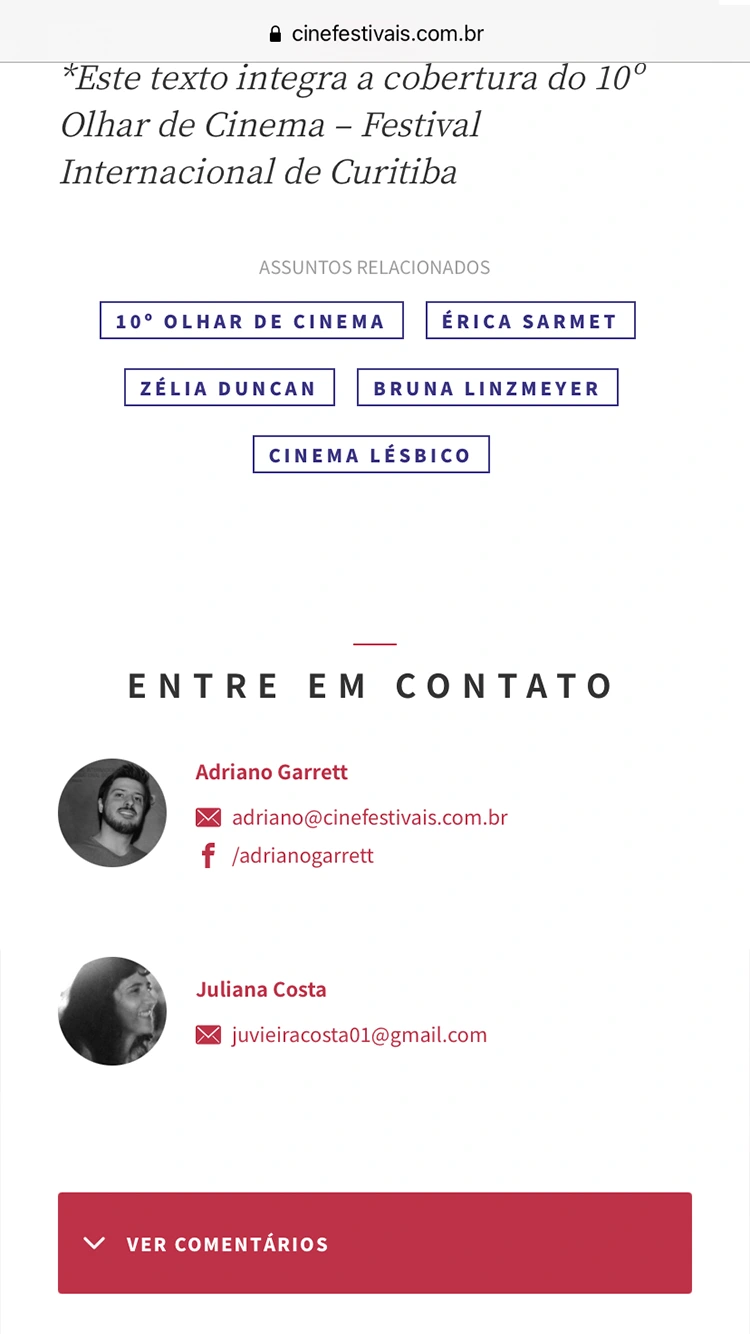
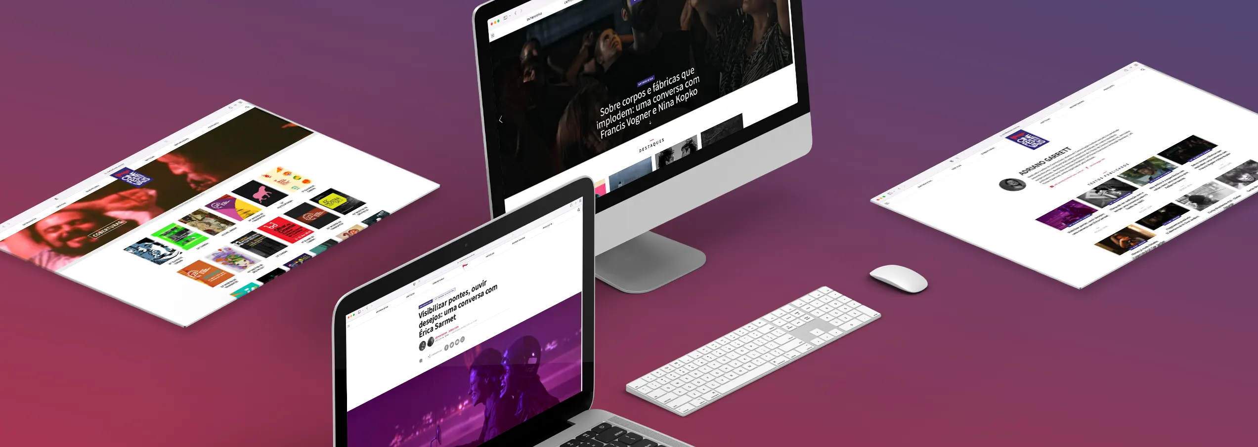
Cine Festivais website’s renewal had a central goal: to enhance comfort in consuming and navigating through content. The new experience aimed to be modern, light, and easy on any device. So comfortable that users would feel at home, on their sofa, ready to embark on a captivating story. Clean layouts, free of distractions, straight to the point, and the choice of typefaces specially crafted for extensive digital reading were fundamental pillars of this development.
EXPERIENCE DESIGN
Just like in the cinema, the experience was designed to amplify the content and immerse the reader in the story of each article
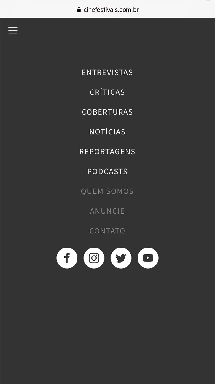
Every detail of the experience was carefully considered so that the stories stand out and, on their own, capture and hold the readers’ attention. No distractions, no anxiety from an overload of options, taking inspiration from printed products that have the power to immerse us. The definitions of layout, colors, typography, and graphic elements were guided by the goal of favoring extensive readings and establishing a consistent, intuitive navigation, straight to the point.
