Our challenge: craft a fresh visual identity to reposition the company in the market
Laticínio Serra Negra, situated in the heart of Minas Gerais, within the Zona da Mata region, is a family-originated business with over two decades of tradition. As one of the key producers of dairy products in the area, it not only supplies the local Minas Gerais market but also extends its reach to Rio de Janeiro and Espírito Santo. Our task involved revamping the visual identity and the entire Dom de Minas product line to achieve the objective of repositioning and gaining more ground in the premium food products market.

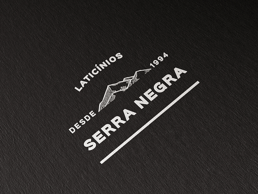
The name Serra Negra is closely tied to the dairy’s location, nestled between the towns of Lima Duarte and Ibitipoca in the state of Minas Gerais. The region is surrounded by imposing mountains and traditional colonial farms.

The concept
Through research and exploratory discussions, it became evident that the forest and the town are integral elements in the lives of everyone involved in the dairy’s production cycle, from producers to consumers. The graphic concept aimed to work with the entire visual context and people’s connection to the location.

Dom de Minas
The redesign of the product line aimed primarily to set it apart at all points of sale, both digital and physical, where the brand was not yet present. Alignment with the development of the Laticínio Serra Negra brand was necessary to combine tradition with modernity and care. The concept sought to highlight “the unique gift (‘dom’) that only Minas possesses.”
While referencing the nature and human interventions in the locality, we also aimed to acknowledge the dairy’s tradition of over two decades, coupled with modern hygiene practices and quality control. To achieve this, we blended modern typography with more rustic illustrations of Minas Gerais towns that were built under imperial society.

Windows, lines, signs, and angles from Rococo-style churches, as well as typical market windows from Minas Gerais, shaped the typography of the “Dom de Minas” logo. The rounded strokes sought to infuse movement and a contemporary feel to the lettering.
The packaging was designed not only to showcase the brand but also to convey the artisanal nature of the product and that it was crafted especially for those seeking a gastronomic experience. Different colors were employed for product line differentiation.