Our challenge: create a new visual identity and conceptualize the platform prototype.
Sigaauto, founded in 2017 and based in southern Minas Gerais, within the technological innovation complex of Itajubá, is a startup focused on the automotive sector. The platform’s primary goal is to integrate business opportunities for workshops interested in bidding on municipal, state, and federal public procurements.
Seeking to increase awareness and establish a presence in investment capture events, the startup needed a new look that represented its differentiators and extensive expertise in both private and public automotive sectors.
Our task involved redesigning its visual identity and conceptualizing a navigable prototype of the platform for validation with investors and prospects.
Visual identity
The aim of the new visual identity was to represent the company’s mission: democratizing and providing speedy access to services and products for the public sector within the automotive industry. Modernity and efficiency were crucial attributes, considering that technology and positive results are essential pillars for all participants in this ecosystem.

The concept
The concept followed three pillars that were clear in the platform:
1. Agility: as the service automates bureaucratic processes;
2. Efficiency: aiding in the understanding of each step;
3. Increased Productivity: both in time and cost savings by streamlining procurement processes.
A sans-serif typeface, chosen to bring modernity, was used entirely in lowercase to represent innovation and user-friendliness. The letters combined with the symbol, in turn attached to the letter g. The circular shape was utilized not only to represent a pie chart but also as a “play” button and the fitting of a piece – an allusion to the connecting role the platform plays in the public and private sectors.
To stand out in a market with few direct competitors, we opted to combine two uncommon colors in the automotive field: purple and orange. Orange signifies movement, reinforcing the idea of agility, while purple is associated with wisdom, creativity, and a welcoming atmosphere for users in various platform experiences. Applications were made on business cards, letterhead, email signatures, social media, and digital channels.


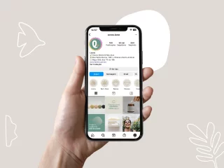
Tangible User Experience
Another significant challenge for the startup was to materialize the company’s proposal in an experience that brought efficiency to its core process. It was necessary to prioritize the focus of its minimum viable product (MVP).
In this regard, we facilitated a one-week design sprint, bringing together developers and analysts to build the MVP concept, which would serve as a showcase for the company. Following the process, a high-fidelity prototype was created to be used as a display for attracting investments and sponsors for Sigaauto’s initial steps.
We conducted research and meetings with angel investors, along with usability tests, to gather insights. The collected data was subsequently used by the development team for the final conception of the company’s first release.